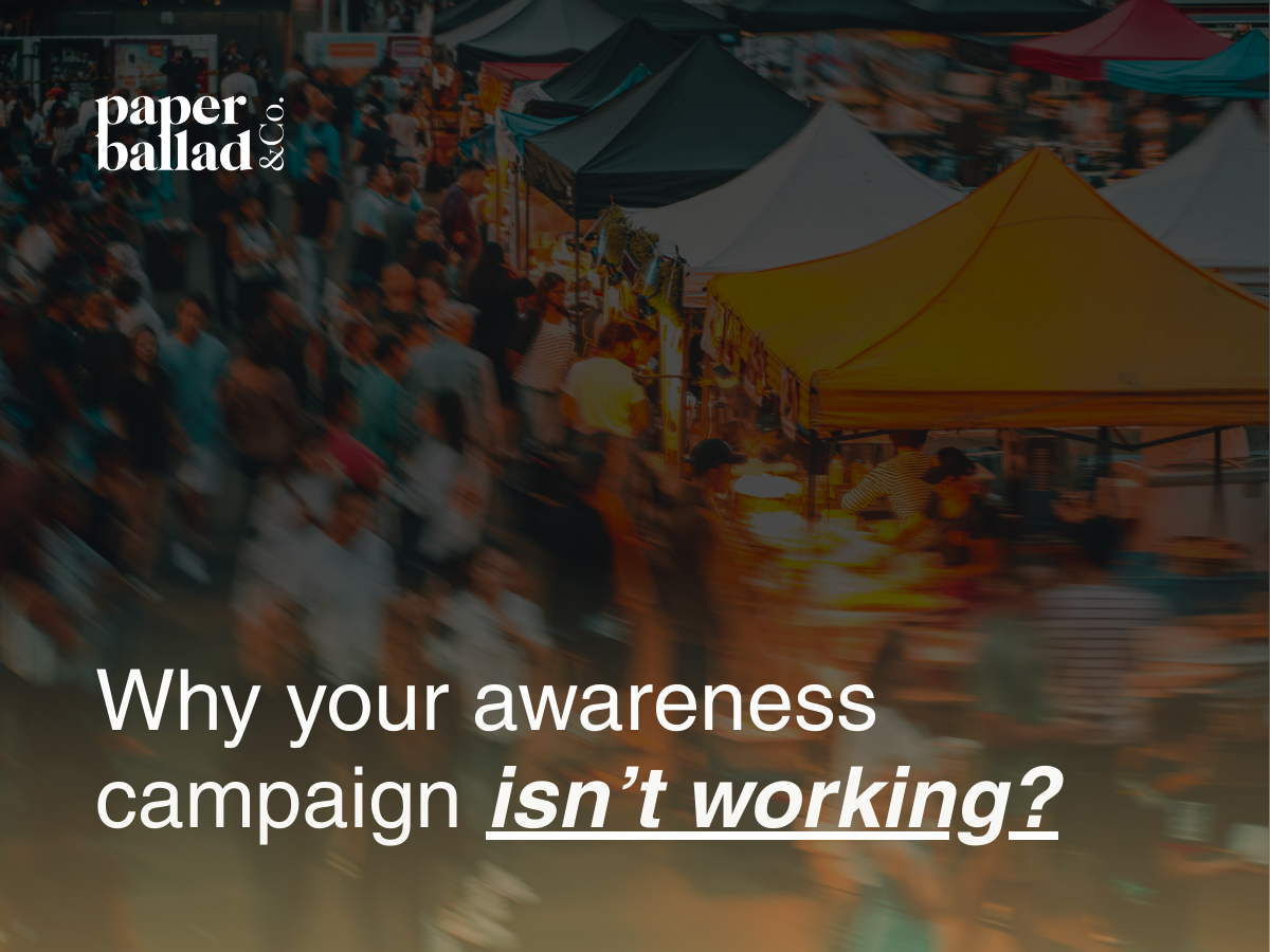
What is a brand awareness campaign?
Brand awareness isn’t just about being seen. It’s how much your audience recognizes, remembers, and associates your brand with a specific value.
Most brands chase visibility alone but memory is what builds familiarity, trust, and long-term brand preference.
The gap between being seen and being remembered is exactly where most brand awareness campaigns fall short and with the right UX-led approach, you can build an awareness campaign that actually sticks.
*Read here to explore our UX Strategy & Content Marketing services to see how intention shapes results.

Why Are Brand Awareness Campaigns Important?
Traditional marketing assumes awareness is a numbers game. Push content, boost it, repeat. But awareness isn’t created by exposure alone, it’s created by experience.
The problem with visibility only awareness campaigns is that reach means nothing if the user doesn’t remember who you are or what you stand for.
1. Users Remember Brands That Blend In
Malaysian consumers scroll instinctively, filter aggressively, and ignore faster than ever. If your awareness campaign looks and feels like every other brand, it gets lost in the feed.
2. Familiarity Only Happens With Consistency
When your visuals shift constantly (different tones, styles, or message structures) the brain fails to form recognition or recall.
Consistency isn’t a design preference, it’s a memory requirement.
This article by Exclaimer reinforces why brand consistency is important in building trust and loyalty.

How to create a Brand Awareness Campaign using UX Strategy
UX Strategy reframes the purpose of an awareness campaign:
Not “How many people saw this?”
But “What did they experience when they saw it?”
1. Designing Awareness Campaigns to Reduce Cognitive Load
Users remember what is easy to process.
A research from Nielsen Norman Group highlights how clarity improves user memory and recognition.
Clear copy, clean composition, and coherent sequencing reduce cognitive load, making your message easier to absorb and harder to forget.
2. Creating Familiarity Through Repetition and Cues
Repetition is not redundancy.
Repeating cues such as colours, phrasing, tone, pacing, symbols, builds distinctive brand memory. When these cues are used consistently, your awareness campaign becomes easier for the brain to store and retrieve. Brand Awareness grows when the brain starts recognizing your brand before reading the words.
Think green for Starbucks, Dark Blue for Zus and Purple for Coffee Bean and Tea Leaf.
We break this down further in our guide to what UX Strategy means for modern brands.

Brand Awareness Campaign Success Metrics
These are the SIX components of every high-performing awareness campaign shares rooted in classic marketing and elevated through UX Strategy:
1. Define the Audience Before Launching an Awareness Campaign
Without this clarity, even the strongest awareness campaigns risk blending into the noise.
Awareness is not “reach everyone.”
Brand awareness is “reach the right people with the right message, repeatedly.”
Map:
- Who they are
- What they feel
- When they scroll
- What they care about
- Where they naturally spend time
This is how you make awareness efficient, not expensive.
2. Clarify the Objective of Your Brand Awareness Campaign
Choose one core objective:
- Brand awareness
- Product introduction
- Category education
- Problem awareness
- Mission or value positioning
Awareness weakens when the message tries to do everything at once.
3. Craft your Campaign Message Engineered for Recall
An awareness campaign requires a message that is:
- Simple
- Repeatable
- Emotionally relevant
- Cognitively light
- Unmistakably yours
Messages that reduce thinking time increase memory retention.
4. Build the Creative System
Users should recognize your brand instantly through:
- Colour system
- Typography
- Tone of voice
- Motion style
- Story structure
- Composition patterns
These are memory anchors, not aesthetics.
5. Use Multiple Channels for Awareness Consistency
This is why a well structured awareness campaign never relies on a single platform to create impact.
Brand awareness grows through repeated exposure across multiple touchpoints:
- Instagram & TikTok
- Display ads
- YouTube
- Influencers
- Search
- PR releases
Each channel reinforces the others, creating the “echo effect” needed for true familiarity.
See how we apply this approach in our multi-channel campaign case studies.
6. Measuring the Impact of Your Brand Awareness Campaign (Metrics/KPI)
Classic metrics:
- Reach
- Impressions
- Frequency
- Brand recall surveys
- Search uplift
UX metrics (the ones that matter):
- Dwell time (Data Points)
- Saves
- Shares
- Sentiment
- Repeated engagement
- Scroll depth
Awareness is not just visibility, it’s resonance.

What a Successful Brand Awareness Campaign Looks Like in Malaysia
Malaysian users are exposed to overwhelming content volume which means premium, intentional campaigns stand out more than loud ones.
Local Nuance and Cultural Cues Drive Recognition.
The Malaysian market responds best to:
- Clean, minimal design
- Clear emotional tension
- Culturally relevant references
- Authentic storytelling
- Predictable brand patterns
Brands that respect the user’s attention earn more attention.
Designing a Brand Awareness Campaign That Sticks
An awareness campaign only works when it:
- Builds clarity
- Forms familiarity
- Strengthens recall
- Respects user attention
- Uses repetition intentionally
- Looks, sounds, and feels cohesive
Build Brand Memory with UX-Led Communication
Memory is designed, Recognition is engineered and Awareness is earned – one intentional touchpoint at a time.
A Call to Thought
When every touchpoint reinforces the same intention, your awareness campaign becomes a coherent brand experience not just a set of posts.
What would your next awareness campaign look like?


